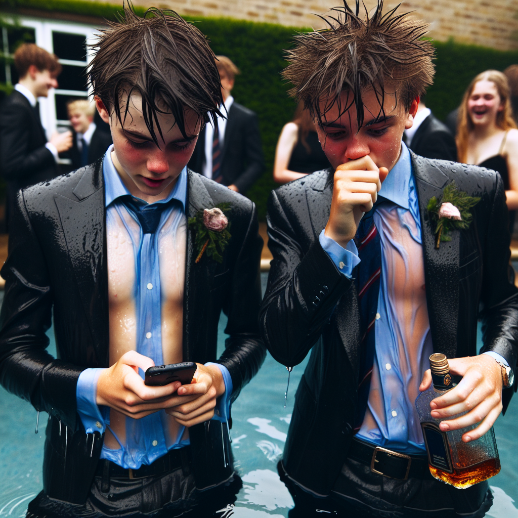
two 18-year-old european boys in all their formal clothes standing by the pool at a party. the water is waist-deep. all their clothes are wet and messy. their hair is wet and messy. one of them is holding a phone. water is dripping from the phone. the other holds a half-empty whiskey bottle. they laugh.
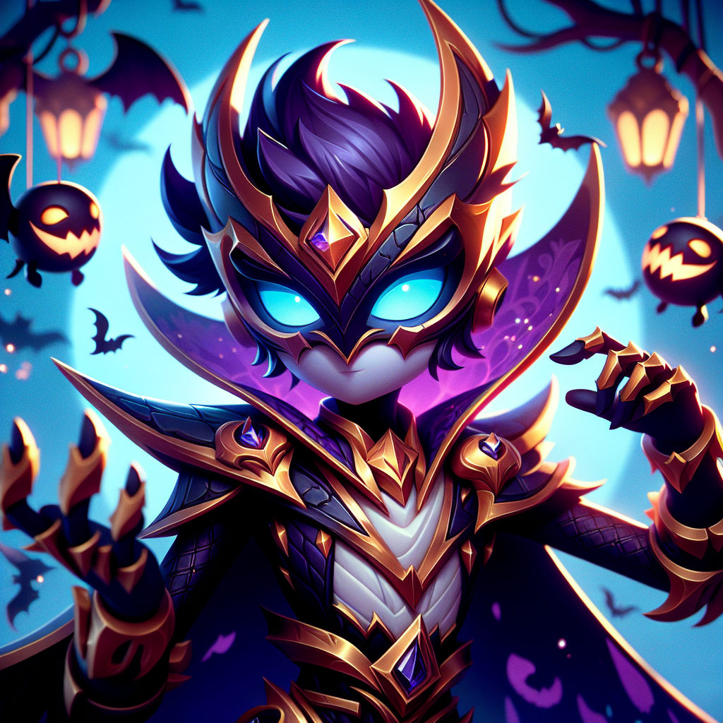
Brawl stars shade Halloween custom
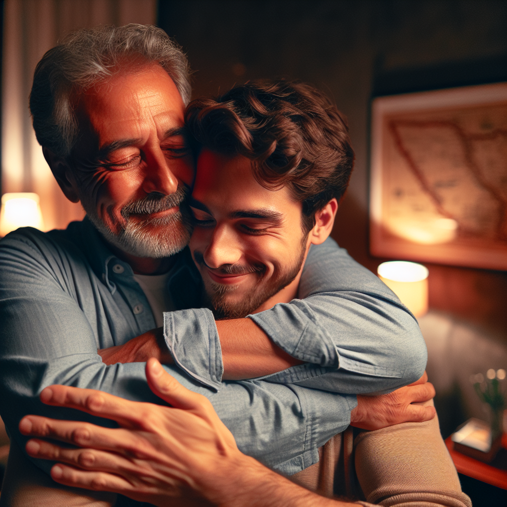
gay dad hugging his young lover
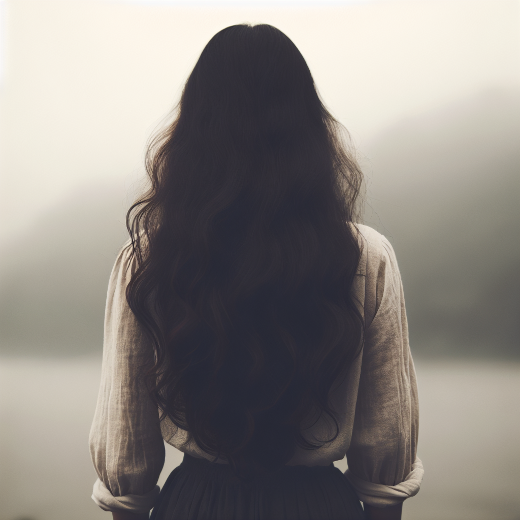
woman back
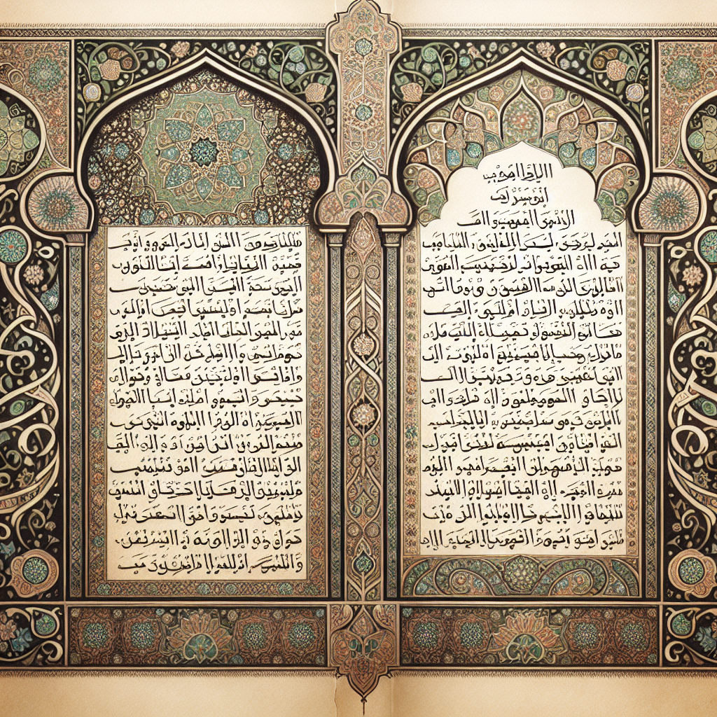
سورة من القران
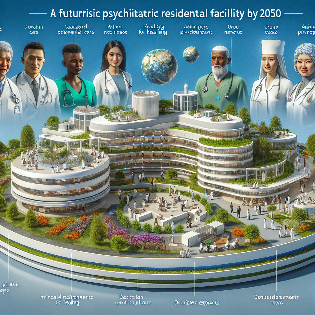
A Psychiatric Residential Facility. Good health care by the year 2050
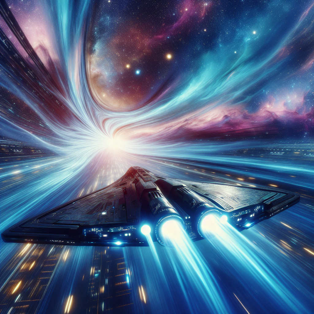
warp drive
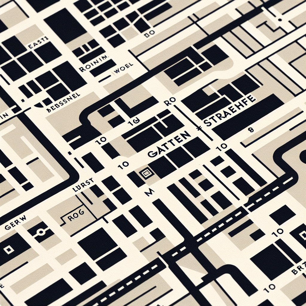
Bauhaus style map with the word Gartenstraße
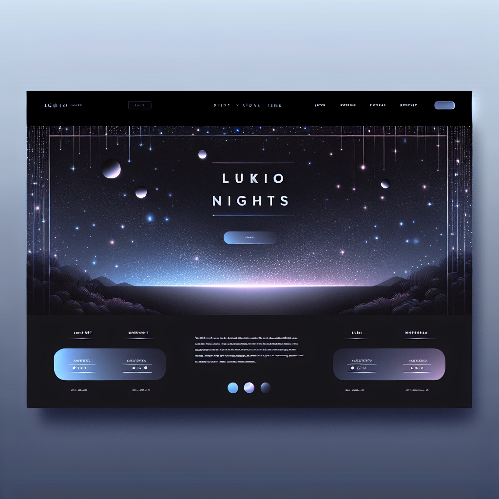
a theme for my website and the name of the brand is lukionights
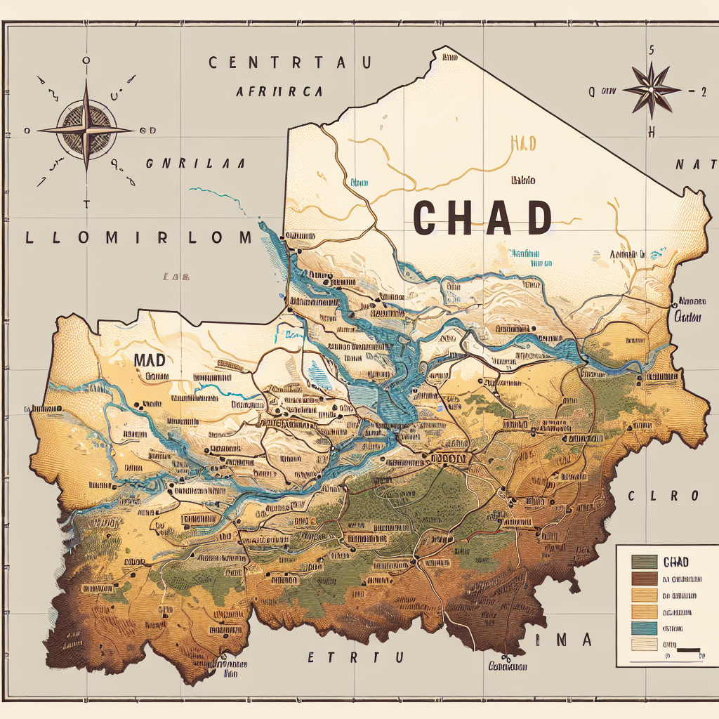
Chad
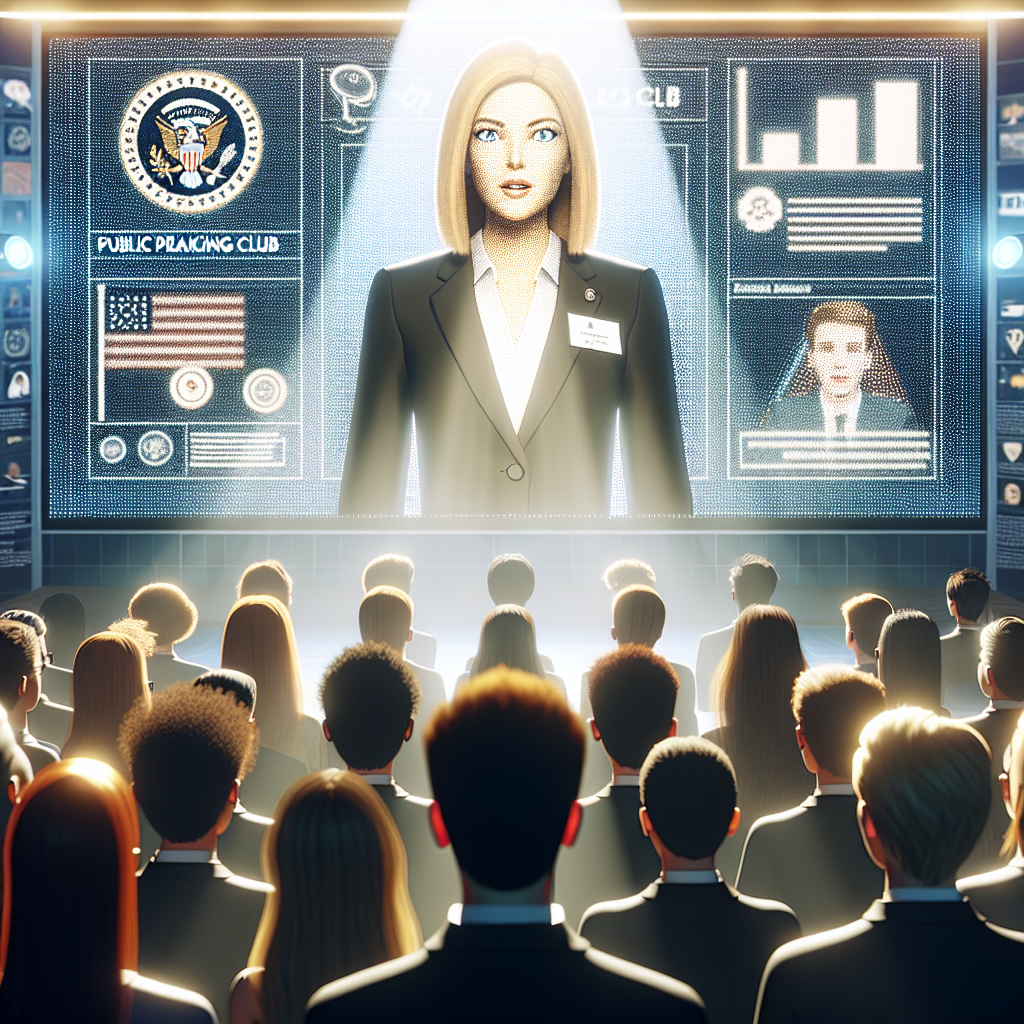
A bright image of a Toastmasters club with 15 young people, Toastmasters logo in the background, screen display and a tall, blonde, busty Norwegian female in a black suit addressing the audience front view
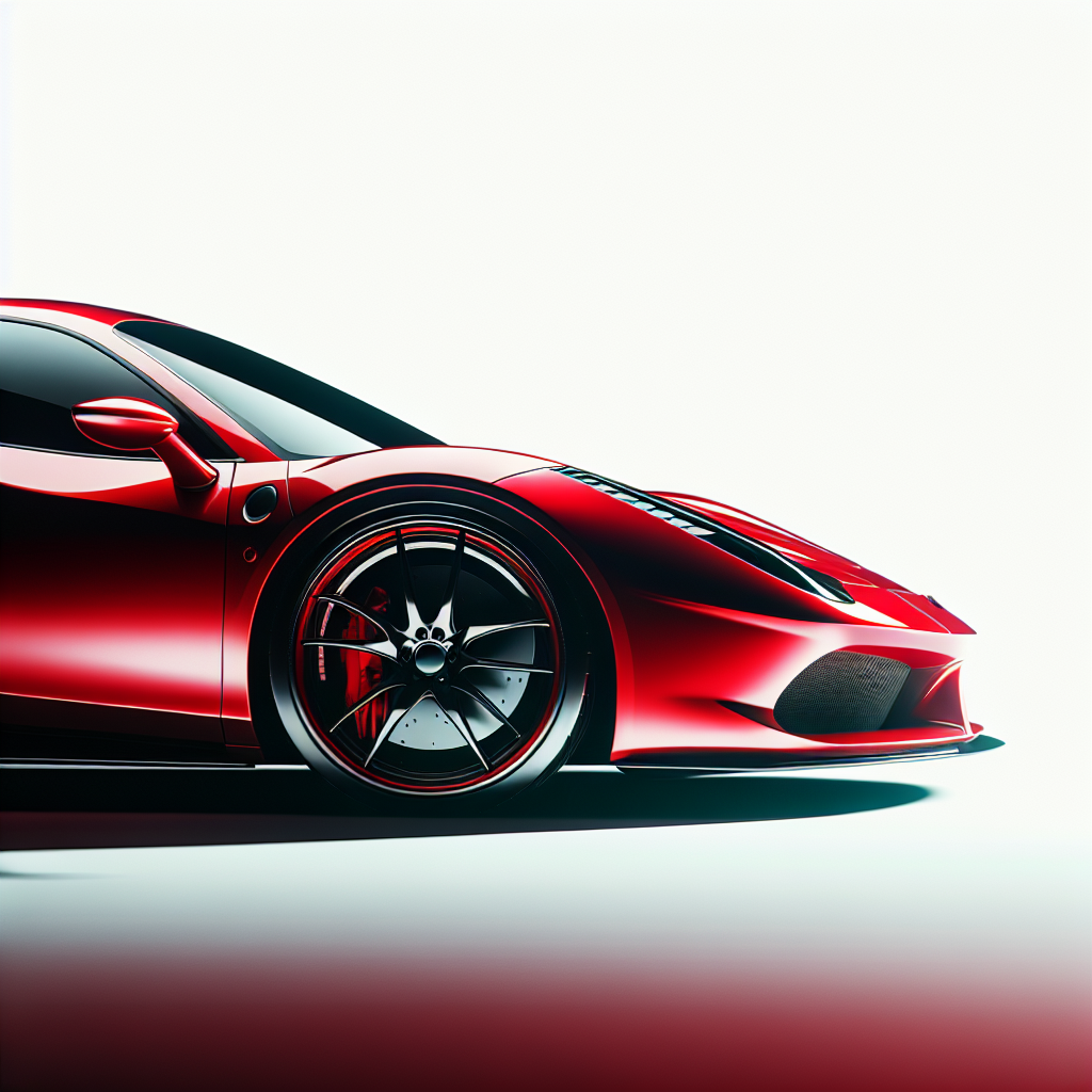
RED SPORT CAR SIDE VIEW WITH WHITE BACKGROUND
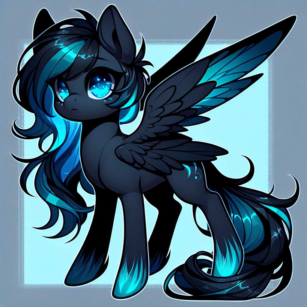
My little pony oc, black pony skin with cyan eyes, dark cyan wings
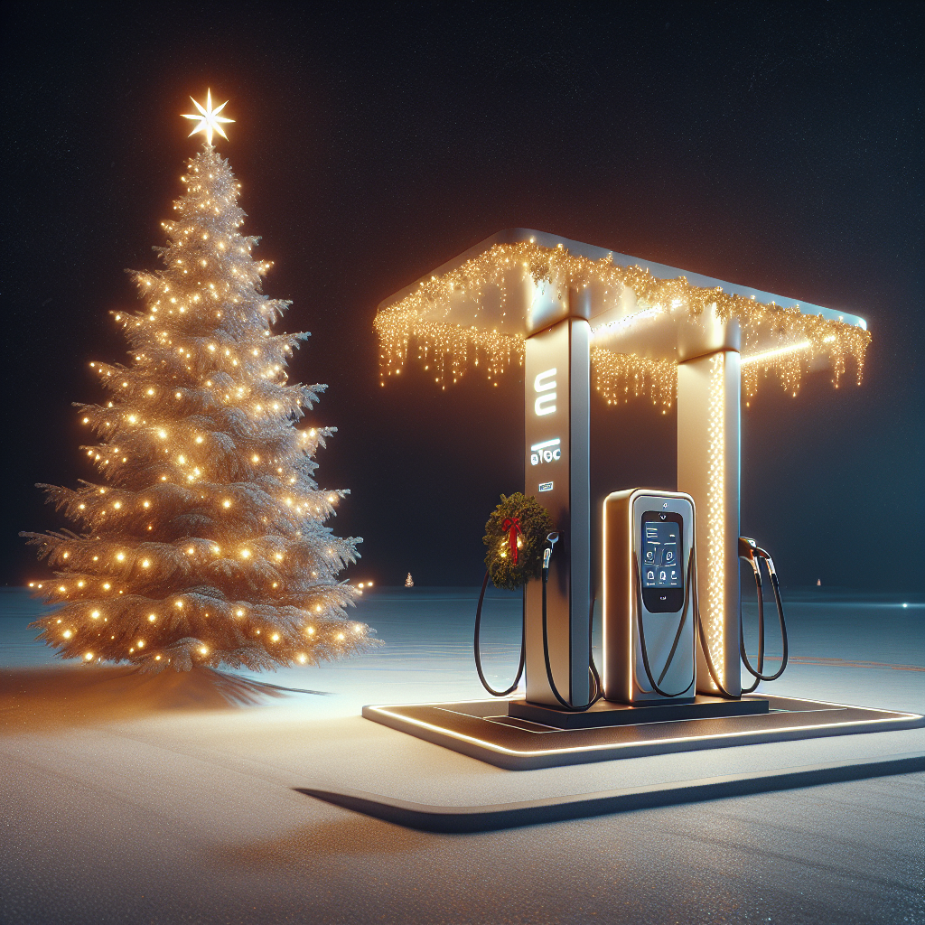
cargibg station with EVTEC name christmas tree and new year light
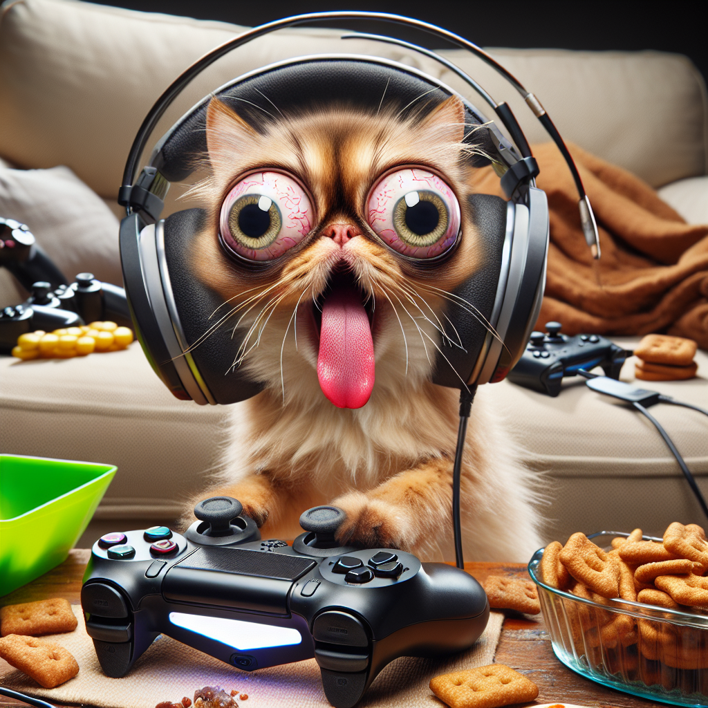
Create a logo featuring a silly cartoon cat or dog that’s deeply engrossed in gaming, wearing oversized headphones. The pet should have an exaggerated, silly expression, with its tongue sticking out and eyes wide, as if it's extremely focused or confused. It could be sitting in a messy pile of snacks and controllers, adding to the humor
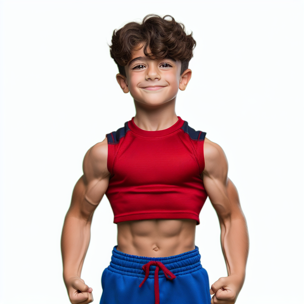
Muscular boy
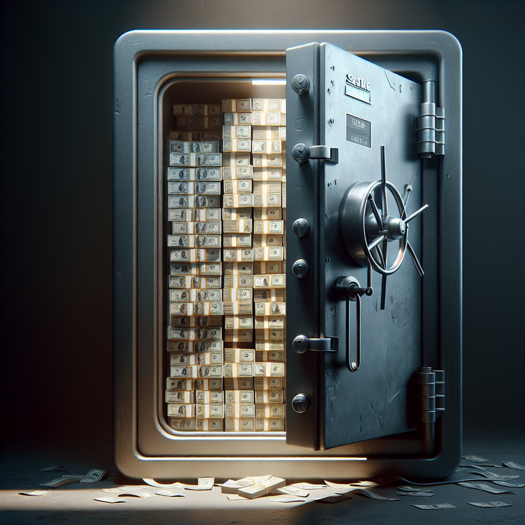
bank safe with full of money
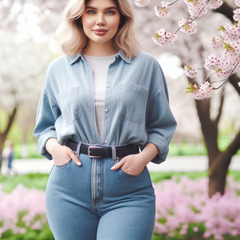
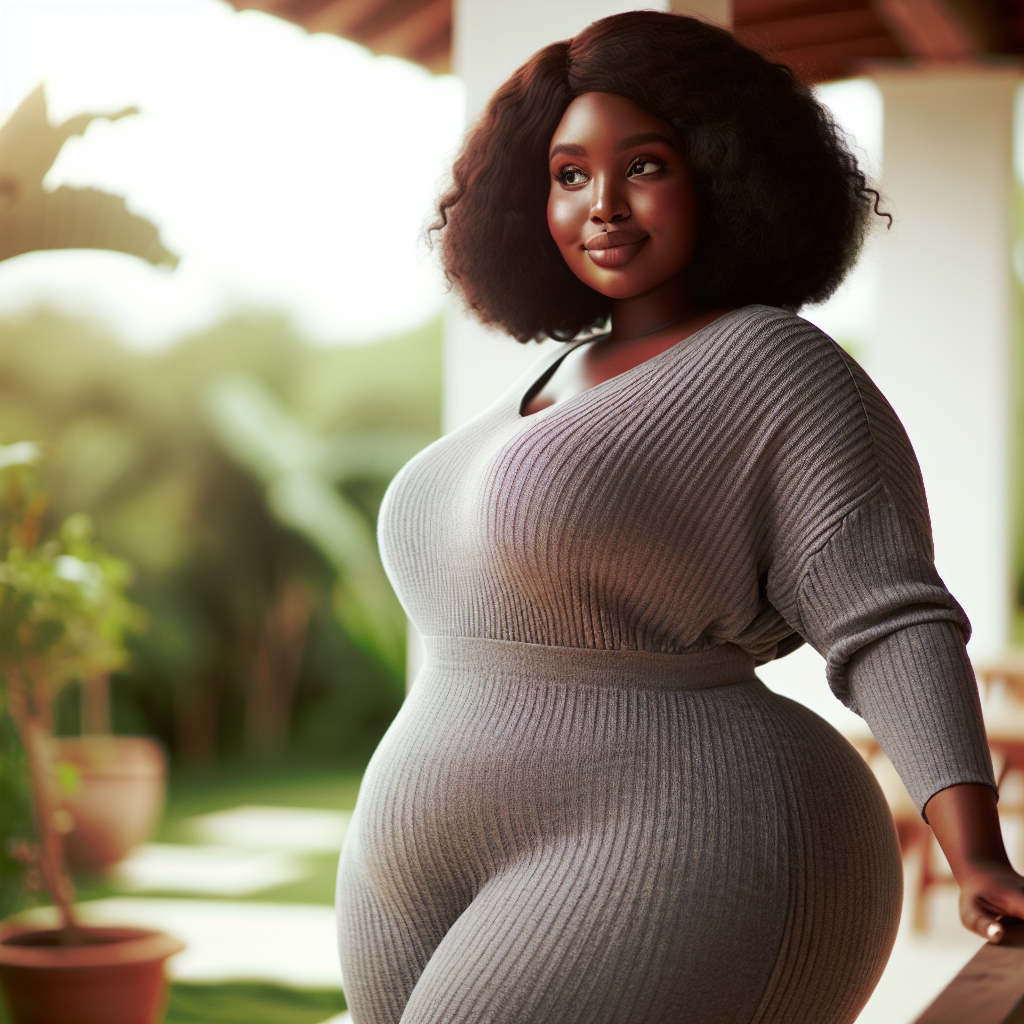
Girl with big butt
بچه گاو در حال خوردن پستونک
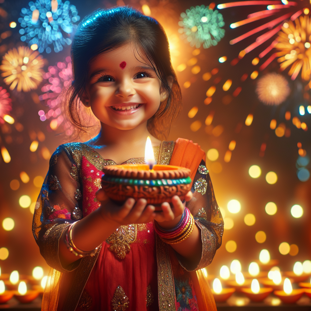
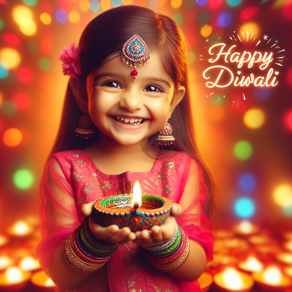
4k happy diwali wishe image with cut little girl hold a amazing diya
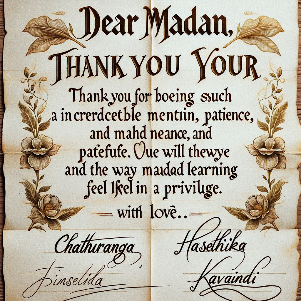
Dear Madam Srinika, Thank you for being such an incredible mentor and guide. We will always be grateful for your kindness, patience, and the way you made learning feel like a privilege. With Love and Gratitude, Chathuranga, Dinelka, Hasthika and Kavindi
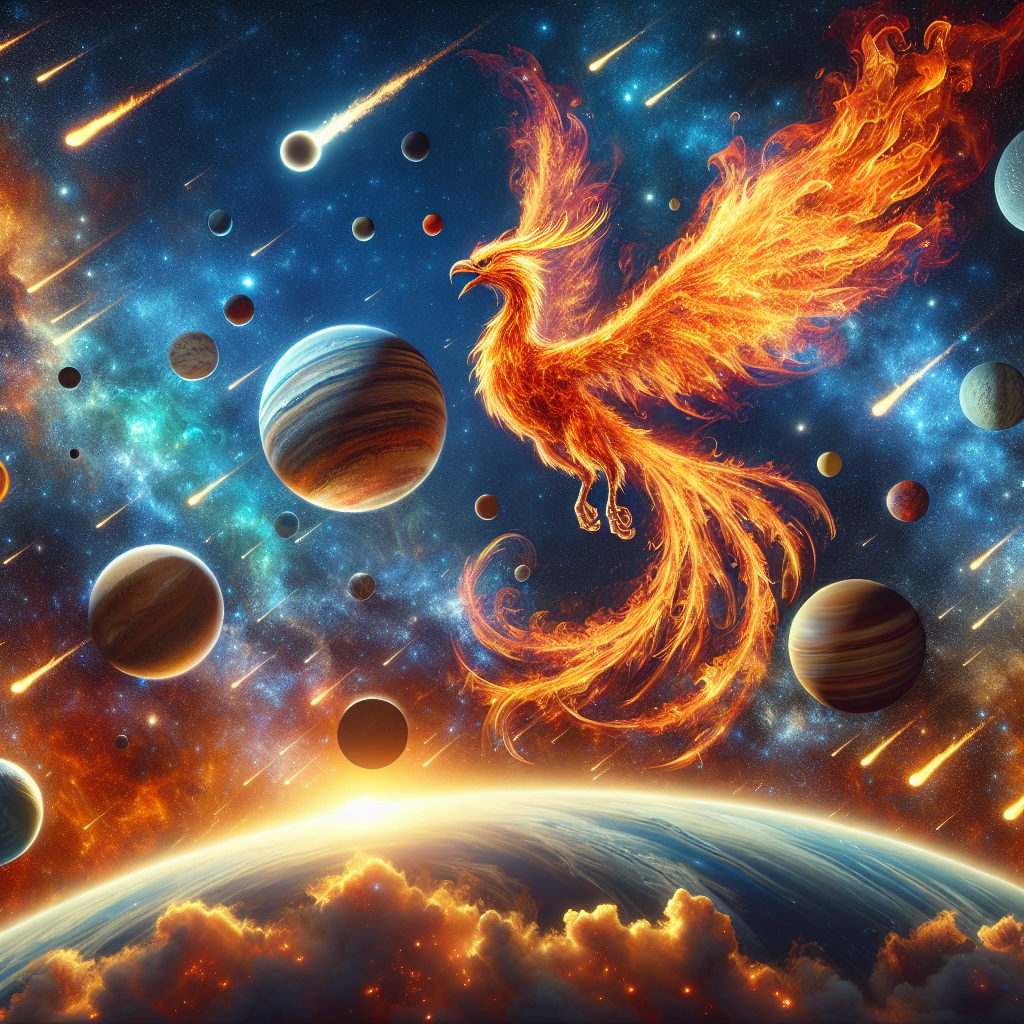
Huge Phoenix bird in fire solar system
Create a Brawl Stars Brawler character inspired by Make a brawler for the oddity shop that specializes in making outfits and dolls and uses scissors to attack This character should perfectly match the style of Brawl Stars.
Girl with big butt
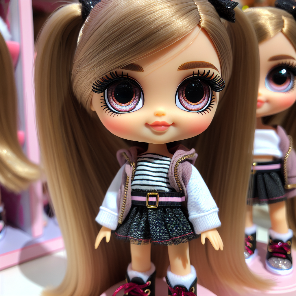
Blythe doll
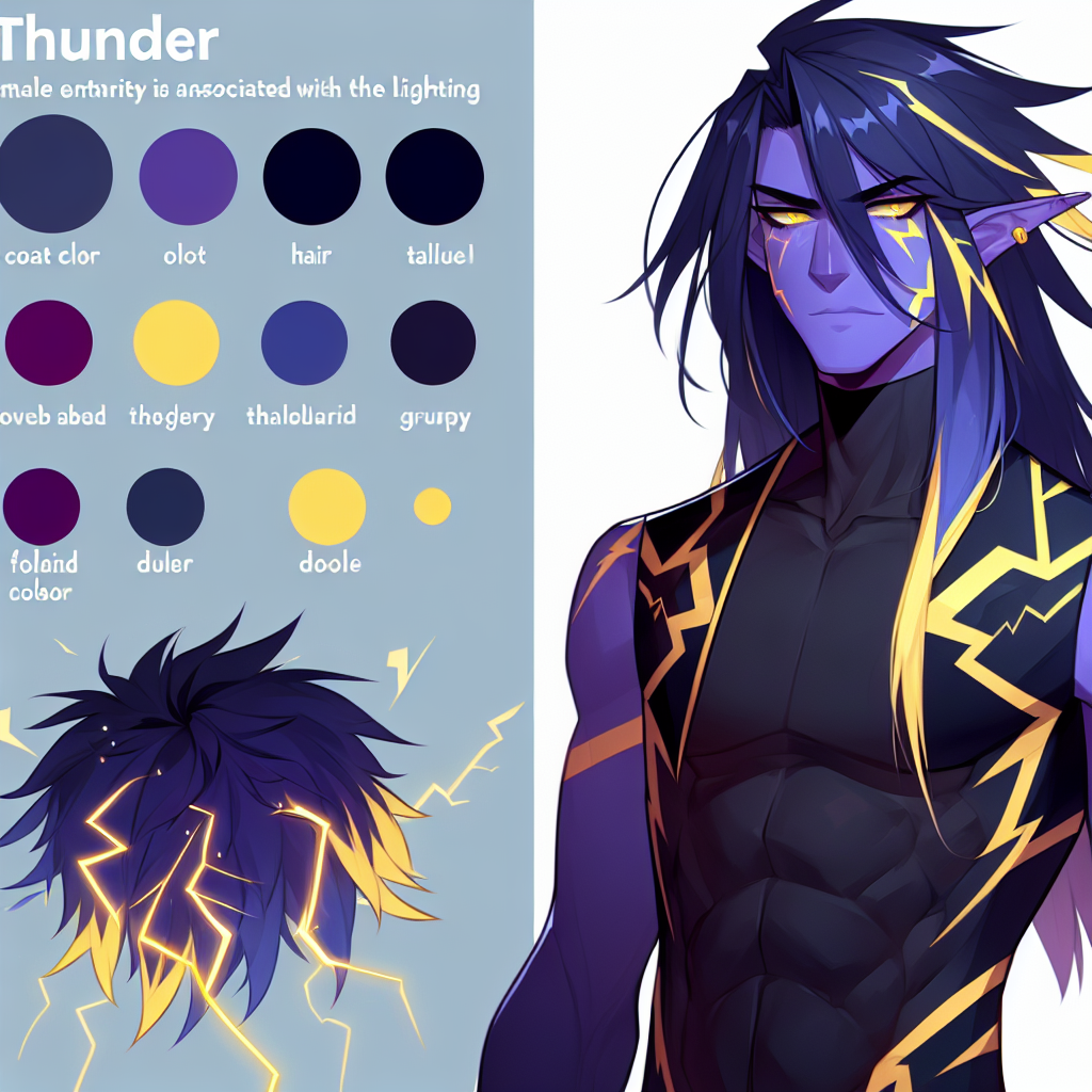
*Name: Thunder *Coat Color: Dark Blue *Haircut: Long and straight and his color is purple with yellow stripes *Magic Element: Lightning *Personality: Energetic and grumpy And he's male
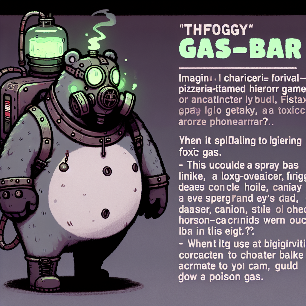
five nights at freddy's oc character "foggy gas-bear (toxic gas/poison gas spray)"
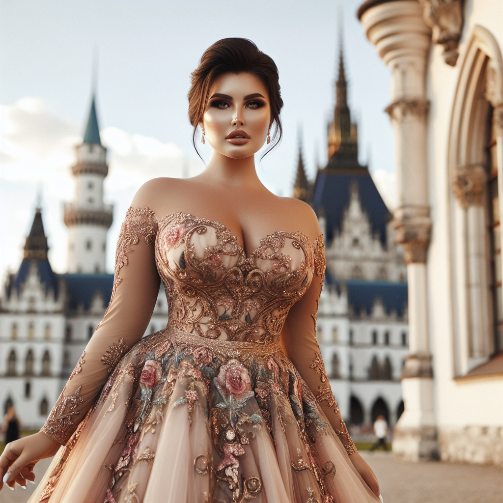
Fiona princess tanned fat girl sexy dress
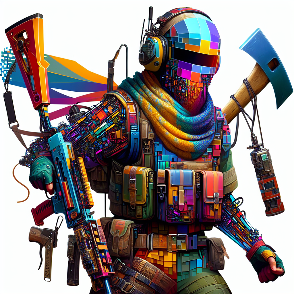
Create a fortnite character from a photo with AI Image generator from text to prompt
4k happy diwali wishe image with cut little girl hold a amazing diya
Cuckold white man, black man, blonde woman
First-person view from the perspective of a truck driver standing beside the road, looking at a large truck parked nearby. The driver holds a piece of paper in the left hand and a tablet in the right hand, with both items visible in the foreground. The setting includes a quiet roadside with green trees and a clear sky, giving a calm and professional atmosphere, as if the viewer is the driver reviewing notes beside the truck.
Find out more about Pict. AI Art Generator
Yes, however, we recommend downloading our iOS Apple App & Android Google Play as it is the best.
Download the Apple iOS App & Android to use our AI.
It specializes in creating unique, high-quality visual images based on text-to-image descriptions.
Yes.
Mostly.
.
Yes, many AI art generators are capable of producing highly realistic drawings and artwork.
Download our app for free and start transforming text-to-image prompts into art images.
Absolutely.


