25 AI Wallpaper Ideas for iPhone in 2026
AI wallpaper ideas for iPhone in 2026 are prompt-based concepts that generate custom Lock Screen and Home Screen backgrounds. The best ideas combine a visual style, a subject, a color palette, and iOS-safe negative space so the clock, widgets, and app icons stay readable.
Creating your image...
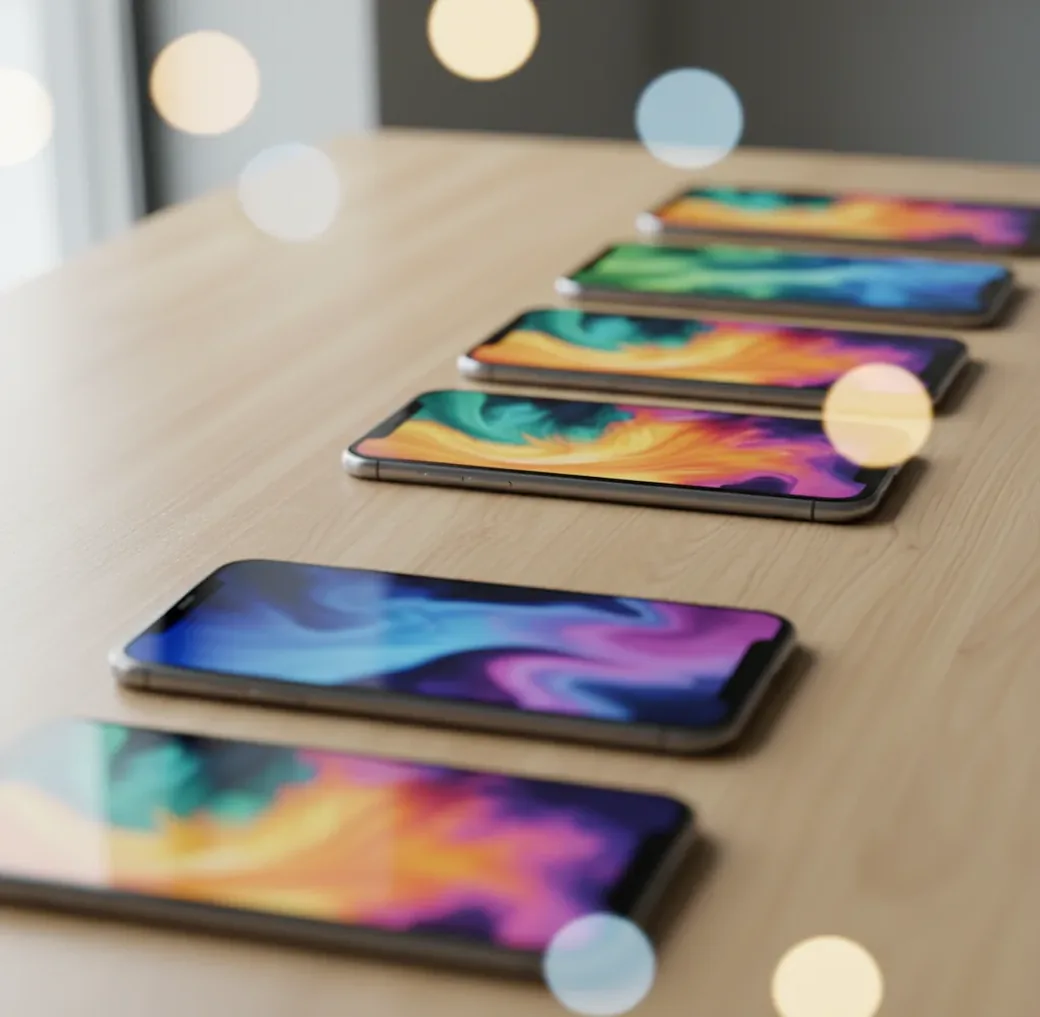
The best AI wallpaper ideas for iPhone in 2026 are portrait prompts designed around negative space, readable contrast, and clean color palettes. Use 9:16 or tall portrait outputs, keep the top area simple for the Lock Screen clock, and create a calmer Home Screen version for icons. Strong prompt themes include misty landscapes, macro textures, soft gradients, bokeh cities, paper-cut scenes, film grain, botanical line art, and dark OLED-friendly abstracts.
What Are AI Wallpaper Ideas for iPhone?
AI wallpaper ideas for iPhone are short creative prompts used to generate vertical phone backgrounds with an AI image model. A strong idea usually includes four parts: subject, style, palette, and layout instruction. For example, “misty pine ridge, soft film grain, teal and charcoal, empty sky at top” gives the model both an aesthetic and a practical iOS composition.
The goal is not just to make a pretty image. A usable iPhone wallpaper has to survive real interface layers: the Lock Screen clock, widgets, notification blur, Dynamic Island area, app icons, dock, Focus modes, and Light or Dark Mode. That is why the best AI phone wallpapers are designed with intentional empty space, moderate contrast, and clean edges.
What Size Should an AI iPhone Wallpaper Be in 2026?
For iPhone wallpapers in 2026, generate in a tall portrait format and export larger than the screen when possible. A safe practical target is 1290×2796 pixels or larger, because it covers many Pro Max-style displays and gives iOS enough detail to crop, zoom, and apply depth or blur effects without obvious softness.
If your generator offers aspect ratios instead of exact pixels, choose 9:16, 9:19.5, or the closest vertical portrait option. For extra-clean results, upscale to a 2K or 4K portrait file before saving. Keep important subjects away from the top 20–30% of the image for the clock and away from the bottom dock zone if the wallpaper will be used on the Home Screen.
How Do You Create AI Wallpapers That Fit iOS Widgets?
Choose a vertical canvas first
Start with 9:16 or a tall portrait ratio instead of generating square art and cropping later. This gives the model more room to compose sky, texture, or background space where iOS overlays will sit.
Pick a 2–4 color palette
Limit the palette before writing the full prompt. Muted teal, charcoal, cream, lavender, sage, sepia, and deep blue tend to hold up well behind widgets and app labels.
Add an iOS-safe layout instruction
Use phrases like “clean top area for clock,” “low-detail background behind icons,” “empty sky at top,” or “simple gradient in bottom dock area.” These composition cues are often more useful than adding more style words.
Generate multiple variations
Create 6–12 versions of the same idea. Small changes in subject placement, brightness, and edge contrast can decide whether a wallpaper feels premium or becomes unreadable on the actual phone.
Screenshot-test the winner
Set the image temporarily or place it behind a screenshot of your Home Screen. Check the clock, widgets, app labels, dock, and notification area before exporting the final version.
Export high and adjust in iOS
Save the largest clean version, then use iOS pinch-to-crop and depth options carefully. If the clock covers the subject, zoom out or regenerate with more negative space.
What Are the Best 25 AI Wallpaper Ideas for iPhone in 2026?
- Misty pine ridge, soft film grain, teal and charcoal palette, empty sky at top, cinematic vertical wallpaper.
- Macro raindrops on glass, blurred neon reflections, dark background, shallow depth of field, OLED-friendly contrast.
- Minimal desert dunes, warm beige gradient, clean upper sky, soft shadows, calm iPhone Lock Screen background.
- Koi fish swirl, Japanese ink wash style, cream paper texture, muted orange and black, no text.
- Astronaut silhouette in fog, monochrome palette, subtle halation, large negative space around the subject.
- Retro synth sunrise, smooth pink and violet gradients, sparse stars, low-detail bottom area for app icons.
- Close-up white marble texture, pale gray veining, soft studio shadows, elegant minimal Home Screen wallpaper.
- Night city bokeh, purple and blue lights, heavy blur, dark edges, no readable signs or letters.
- Floating jellyfish, deep ocean black, gentle cyan glow, centered subject below the clock area.
- Paper-cut mountain layers, pastel blue and peach, clean top band, soft handmade texture.
- Botanical line art, off-white background, muted sage accents, thin ink strokes, lots of open space.
- Vintage map texture, faded sepia paper, minimal unlabeled shapes, no words, subtle grain.
- Snowy forest path, soft focus, high contrast trunks, pale sky, cinematic winter Lock Screen.
- Lava lamp blobs, creamy orange and magenta gradients, dark edges, abstract 1970s mood.
- Cyberpunk alley in rain, shallow depth of field, neon reflections, subject-free center for widgets.
- Watercolor clouds, pale pink and lavender, airy sky composition, gentle paper texture.
- Blue-and-white ceramic tile pattern, subtle imperfections, low contrast, clean geometric rhythm.
- Granite macro with gold flecks, matte stone surface, controlled sparkle, premium texture wallpaper.
- Abstract ink in water, black background, slow-motion smoke tendrils, high contrast but uncluttered.
- Studio-lit fruit still life, single pear or orange, deep shadow, minimal editorial composition.
- Minimal Saturn rings icon, flat colors, empty top third, soft gradient background.
- Lotus pond at dawn, foggy muted greens, quiet water surface, subject below center.
- Film photo of highway lights, long exposure streaks, dark road, nostalgic grain.
- Origami crane field, soft paper texture, neutral tones, shallow depth of field.
- Geometric isometric blocks, matte shading, low detail, soft shadows, modern creator-brand aesthetic.
Which Prompt Templates Work Best for iPhone Wallpapers?
- Lock Screen template: “[subject], [style], [2–4 color palette], clean top area for clock, centered lower composition, vertical iPhone wallpaper, soft grain, no text.”
- Home Screen template: “[texture or abstract scene], low-detail pattern, consistent contrast, muted [palette], simple bottom dock area, vertical phone wallpaper, no logos, no text.”
- Matching set template: “Create two iPhone wallpapers from the same palette: one dramatic Lock Screen with subject below the clock, one calmer Home Screen with blurred texture and fewer details.”
- Dark Mode template: “[subject], black or charcoal background, subtle glow, high contrast edges, OLED-friendly, minimal bright areas, clean icon readability, vertical wallpaper.”
- Minimal aesthetic template: “[single subject or texture], editorial minimalism, large negative space, matte finish, soft shadow, neutral palette, no text, no clutter.”
- Negative prompt add-on: “avoid text, logos, extra faces, distorted hands, busy top area, harsh banding, over-sharpened edges, noisy gradients, watermark.”
How Do Diffusion Models Make AI Wallpapers Look Sharp?
Most AI wallpaper generators use diffusion models, which start from random noise and repeatedly denoise the image until it matches the prompt. The model does not “place an iPhone clock,” but it can follow composition language such as “empty sky at top,” “centered lower subject,” or “low-detail background.” That is why prompt structure affects usability, not just style.
Many systems generate in a compressed latent space before decoding to pixels. If the result looks soft, an upscaler or super-resolution model can add cleaner edges and smoother texture. Upscaling works best on already-good compositions; it cannot reliably fix a subject hidden under the clock, unreadable icon contrast, or fake text artifacts. Sharpness is a mix of resolution, composition, denoising quality, and final iOS cropping.
Which AI Wallpaper Tool Should You Use?
| Tool type | Best for | Strengths | Watch-outs |
|---|---|---|---|
| Pict AI | Fast iPhone-style wallpaper batches | Browser workflow, prompt variations, simple editing, upscaling, quick portrait experiments | Output quality still depends on prompt specificity, safe-zone testing, and final crop |
| Midjourney | Highly stylized art direction | Strong aesthetics, cinematic lighting, rich texture, good for premium-looking packs | Requires prompt tuning and external cropping for exact phone-safe layouts |
| Adobe Firefly | Commercially cautious creative workflows | Useful for branded visuals, graphic styles, and integration with design editing tools | May feel less experimental for surreal or highly niche wallpaper aesthetics |
| Canva AI tools | Simple creator templates and social visuals | Easy layout editing, text removal, resizing, and brand kit workflows | Generated art can look template-like unless prompts are specific |
| Free web generators | Casual wallpaper experiments | Low-friction testing, quick idea exploration, often no design experience needed | Watermarks, queues, lower resolution, usage limits, and inconsistent mobile exports are common |
Choose the tool based on workflow, not hype: use art-first tools for style exploration, design suites for layout control, and quick generators for rapid prompt testing.
Where Do AI Wallpapers Work Best on iOS?
- Lock Screen portraits with a subject placed below the clock, such as foggy mountains, lone astronauts, flowers, or minimal planets.
- Home Screen textures that do not compete with icons, such as marble, paper grain, soft gradients, blurred bokeh, or ceramic patterns.
- Seasonal packs for winter fog, spring botanicals, summer skies, autumn sepia, holiday lights, and New Year metallics.
- Focus Mode sets where Work, Sleep, Fitness, Travel, and Creative modes each get a distinct but related palette.
- Creator branding backgrounds using muted brand colors, abstract shapes, and low-detail negative space instead of logos.
- Gift wallpapers for partners, friends, or clients when the prompt reflects a shared place, pet, hobby, color, or inside joke without adding text.
- Portfolio or social media previews where the wallpaper pack becomes a visual system, not a single isolated image.
When Do AI Wallpapers Fail on iPhone Screens?
- Busy top compositions fail because the iOS clock, widgets, Dynamic Island area, and notification stack cover the most visually important details.
- Low-contrast Home Screen backgrounds make app labels hard to read, especially with transparent widgets or colorful custom icon packs.
- Ultra-smooth gradients can show color banding on OLED displays; adding subtle grain, texture, or a higher-resolution export usually helps.
- Tiny fake text, signs, labels, and logos often look broken because image models are still unreliable with small typography.
How Can You Turn One Wallpaper Idea Into a Full iPhone Pack?
Lock the palette
Choose one color system first, such as charcoal, cream, and muted teal. A fixed palette makes the pack feel intentional even when the subjects change.
Create a dramatic Lock Screen version
Use the strongest subject, lighting, or depth in the Lock Screen image, but keep the top third open enough for the clock.
Create a calmer Home Screen version
Generate a related texture, blur, or abstract version with fewer focal points. This keeps app icons readable while still matching the Lock Screen.
Make Focus Mode variants
Shift the same concept into Work, Sleep, Travel, and Fitness versions by changing brightness, contrast, or subject intensity rather than starting over.
Export and name consistently
Save files with clear names such as “pine-fog-lock,” “pine-fog-home,” and “pine-fog-sleep.” Consistent naming helps if you sell, share, or archive wallpaper packs.
Related Pict.AI reads for creators and editors
Frequently Asked Questions
The best prompt includes a subject, style, palette, vertical format, and iOS-safe layout instruction. Example: “misty pine ridge, soft film grain, teal and charcoal, clean top area for clock, vertical iPhone wallpaper, no text.”
Use a tall portrait ratio such as 9:16 or 9:19.5. If exact ratios are unavailable, generate vertically and crop inside iOS.
A practical target is 1290×2796 pixels or larger. Exporting bigger than the screen helps preserve detail when iOS crops, zooms, or applies effects.
Prompt for an empty or low-detail top area and place the main subject below the clock zone. Test the image on the actual Lock Screen before saving it as final.
Yes. Use the same palette and subject family, then make the Lock Screen more dramatic and the Home Screen simpler, blurrier, or more texture-based.
Blurry wallpapers usually come from low export resolution, aggressive cropping, or a soft generation. Regenerate larger, upscale before saving, and avoid zooming too far in iOS.
Striped gradients are usually color banding, which is easier to see on OLED screens. Add subtle grain or texture and export at a higher resolution to reduce it.
Often yes, but usage depends on the generator’s license, the prompt, and whether protected logos, characters, or copyrighted styles are involved. Use original prompts and check the tool’s commercial terms.
Yes, AI wallpapers are just image files when downloaded from a trusted source. Avoid suspicious download links, unknown configuration profiles, or files that are not standard image formats.