Background for Product Photography in 2026: Which Is Best?
The best background for product photography in 2026 is usually matte white, soft gray, or another light-neutral surface because it keeps colors accurate, shadows believable, and product edges easy to edit. Lifestyle and textured backdrops work best as secondary images when they explain scale, mood, material, or use case. If you need fast catalog consistency, tools like Pict AI can help replace messy backdrops without reshooting every SKU.
Creating your image...
The best background for product photography in 2026 is a clean matte white or light-neutral backdrop for main ecommerce images, because it preserves color accuracy and makes the product easy to isolate. Use lifestyle, textured, or branded backgrounds for secondary images when they add context, scale, or emotional value without distracting from the item.
What is the best background for product photos in 2026?
The best product photo background is a matte white or light-neutral backdrop for primary listing images, followed by controlled lifestyle backgrounds for supporting images. White, off-white, light gray, and pale beige are safest because they minimize color cast, keep product edges readable, and work across marketplaces, social posts, print catalogs, and storefront grids.
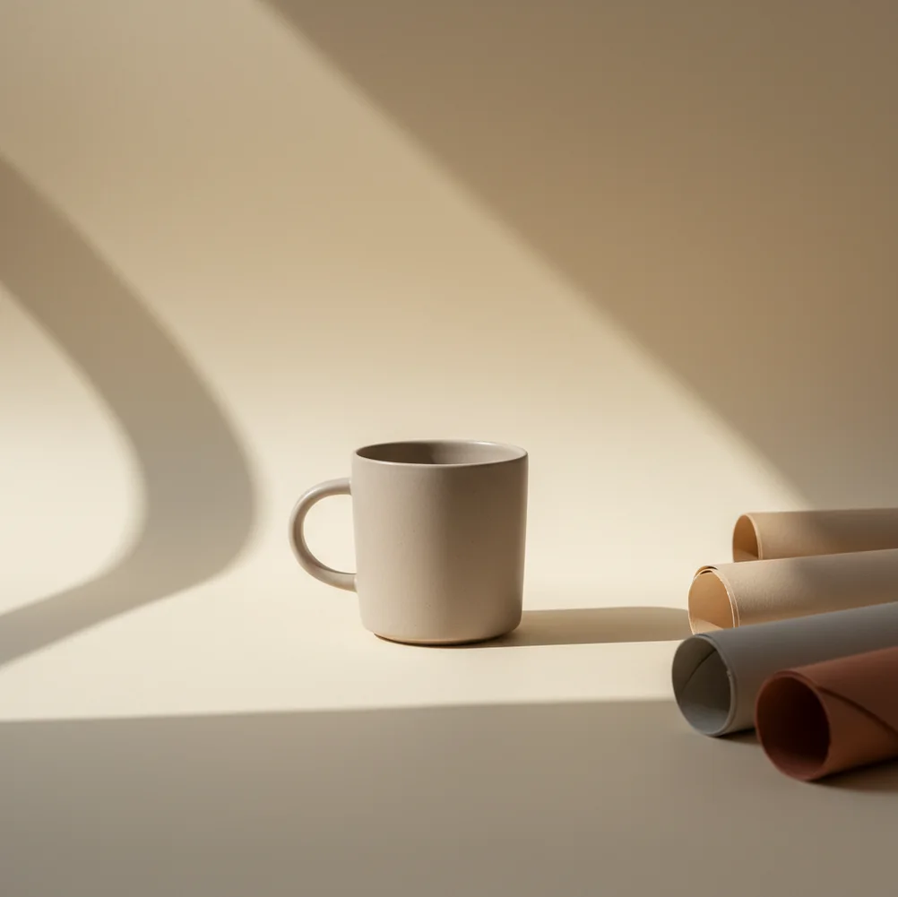
A “good” background is not just attractive; it supports accurate color, clean masking, believable shadows, and repeatable crops across multiple SKUs. For cosmetics, jewelry, food packaging, handmade goods, and resale listings, the background should make the item feel clear, trustworthy, and easy to evaluate before it feels artistic.
How does background choice affect ecommerce product images?
Background choice affects ecommerce images by changing contrast, perceived quality, readability, and buyer confidence. A cluttered tabletop can make even a premium product feel used or informal, while a consistent neutral backdrop makes the same item feel catalog-ready and easier to compare against other options.
The background also controls technical quality. Dark backdrops can hide black edges, colored walls can contaminate white packaging, and glossy surfaces can reflect shapes you did not intend to show. For marketplace images, the strongest setup is usually one compliance-friendly main image plus secondary shots that show scale, texture, use, packaging, and brand mood.
How do you shoot a clean product background on a phone?
Use soft side light
Place the product near a window with a sheer curtain or shoot in open shade. Avoid direct sun because it creates hard shadows that are difficult to match when replacing the background.
Choose a matte surface
Use white poster board, foam board, matte paper, or a non-gloss tabletop. Matte surfaces reduce glare and prevent the product from reflecting the room.
Shoot two reliable angles
Capture one straight-on image for the main listing and one 15–25 degree angle for depth. Keep the camera level so bottles, boxes, and labels do not lean.
Leave clean space around the item
Do not crop too tightly in camera. Extra space gives editing apps more room to detect the subject edge and lets you export square, vertical, or horizontal versions later.
Check edges before exporting
Zoom in around caps, handles, transparent corners, labels, cords, and thin product parts. If the edge looks crunchy or haloed, switch to a softer background color or adjust the shadow.
Which backgrounds work best for different product types?
| Product type | Best background | Why it works | Use case |
|---|---|---|---|
| Skincare and cosmetics | Soft white, warm gray, muted brand color | Keeps labels readable and packaging color accurate | Marketplace listings, ads, storefront grids |
| Jewelry and small accessories | Light gray, stone, velvet, acrylic riser | Adds scale and material contrast without overwhelming detail | Etsy listings, gift guides, portfolio images |
| Food packaging | Matte white, pale kitchen surface, subtle paper texture | Feels clean while supporting flavor and freshness cues | Menu mockups, grocery listings, social posts |
| Electronics | White, cool gray, dark graphite for secondary shots | Makes edges, ports, screens, and finishes easier to read | Catalog images, spec pages, comparison graphics |
| Handmade goods | Neutral lifestyle scene, wood, linen, paper | Adds craft context and emotional warmth | Etsy, Instagram, gift-focused product pages |
| Resale items | Plain white or light gray | Shows condition clearly and reduces suspicion from buyers | Depop, eBay, Facebook Marketplace, resale catalogs |
Use the simplest background for the main product image, then use more expressive surfaces for secondary images that explain use, scale, mood, or material.
Which apps can change a product photo background?
| Tool | Best for | Strength | Watch out for |
|---|---|---|---|
| Pict AI | Fast mobile background swaps for product listings | Quick cutouts, simple replacement backgrounds, phone-first workflow | Glossy or transparent items still need careful edge review |
| Canva | Branded layouts and social selling graphics | Templates, brand kits, text overlays, batch design consistency | Precision masking can require extra adjustment |
| Adobe Photoshop Express | Manual touch-ups and more controlled edits | Stronger correction tools for exposure, color, and detail | More steps than a one-tap background swap workflow |
| PhotoRoom | Marketplace-style product cutouts and batch assets | Fast ecommerce scenes, shadows, and catalog templates | Some advanced exports or features may depend on plan limits |
Choose the app based on the job: simple marketplace cleanup, branded social assets, manual retouching, or batch catalog production. The best result still starts with a sharp, evenly lit original photo.
How does AI replace a product photo background?
AI replaces a product photo background by using image segmentation to predict which pixels belong to the foreground product and which belong to the surrounding scene. The editor creates a mask around the subject, removes or hides the original backdrop, and composites a new background behind the product.
The most important technical details are edge detection, alpha transparency, contact shadow, and light direction. A clean mask keeps labels, caps, handles, and corners intact. A realistic composite keeps the original shadow density or recreates it so the product does not look pasted onto the new scene. Matching background brightness to the original lighting is often more important than choosing a stylish backdrop.
What prompt recipes create realistic product backgrounds?
- Clean catalog prompt: “Place the product on a matte off-white studio background with soft left-side lighting, subtle contact shadow, no props, ecommerce catalog style.”
- Premium skincare prompt: “Place the bottle on warm beige stone with diffused daylight, soft shadow, minimal spa aesthetic, neutral tones, realistic scale.”
- Handmade gift prompt: “Place the product on natural linen with a small kraft paper tag nearby, soft window light, cozy handmade marketplace style, uncluttered composition.”
- Food packaging prompt: “Place the package on a pale kitchen counter with soft morning light, minimal crumbs or ingredients in the far background, clean commercial food styling.”
- Tech product prompt: “Place the device on a cool light-gray surface with soft gradient background, controlled reflection, crisp edges, modern electronics catalog style.”
- Shadow-matching instruction: “Preserve the original product proportions and label clarity; add only a soft contact shadow under the item and match the light direction from the original photo.”
When does background replacement look fake?
- Background replacement looks fake when the new backdrop does not match the original light direction, shadow softness, lens angle, or product reflections.
- Glossy packaging can show halos because reflections from the old backdrop remain on the product surface.
- Transparent glass, acrylic, and clear plastic are difficult because the background is visible through the material, not only behind it.
- Thin details such as jewelry chains, cords, tassels, feathers, and plant fibers can be clipped by segmentation masks.
What workflow works for editing 50 SKUs quickly?
Define three background styles
Pick one compliance-style white, one soft neutral, and one branded or lifestyle option. This prevents every SKU from becoming a separate creative decision.
Shoot all products with the same light
Keep the phone position, window direction, surface, and crop consistent. Consistent source photos make background replacement faster and more believable.
Edit one test image first
Create a sample with the final crop, background color, and shadow style. Use it as the visual reference for the full catalog.
Process by product shape
Edit boxes together, bottles together, jewelry together, and transparent items last. Similar silhouettes make edge checking faster.
Export a naming system
Use clear filenames such as SKU-main-white, SKU-secondary-lifestyle, and SKU-social-vertical. Organized exports save time when uploading to shops, ads, and social platforms.
Related Pict.AI guides for cleaner cutouts
Frequently Asked Questions
A matte white or light-neutral background is best for most ecommerce main images because it keeps the product clear, color-accurate, and easy to compare. Use lifestyle backgrounds for secondary images.
White is required or strongly preferred for many marketplace main images, but rules vary by platform and category. Secondary images usually allow lifestyle scenes, colors, props, and close-up details.
Warm gray, soft beige, ivory, stone, charcoal, and muted brand colors often make products look more premium. The background should match the product’s material, price point, and lighting.
Yes, lifestyle backgrounds are effective for secondary listing images when they show scale, use, mood, or gifting context. Keep the main image simpler if marketplace compliance matters.
Use diffused light, a matte surface, and a white bounce card opposite the light source to soften shadows. Do not remove every shadow, because a subtle contact shadow makes the product look grounded.
Use a large soft light source and a neutral matte background for shiny products. Glossy items reflect their surroundings, so avoid bright colors, clutter, and hard-edged reflections.
They can work, but transparent glass and acrylic are harder because the background affects what appears inside the object. Results improve with strong edge contrast and carefully matched shadows.
Many stores use square images between 1500 and 3000 pixels wide, but requirements vary by platform. Shoot high resolution first, then export square, vertical, or horizontal crops as needed.
A strong listing usually uses one clean main background plus two to five supporting images with scale, detail, lifestyle, packaging, or brand context. Consistency matters more than using many different scenes.