How to Add a Gradient Background to Photos
You can add a gradient background to photos by cutting out the subject, placing it over a linear, radial, or diagonal color fade, and refining the edge so the subject does not look pasted on. The cleanest edits use a high-resolution photo, colors sampled from the original image, and a subtle gradient that matches the lighting.
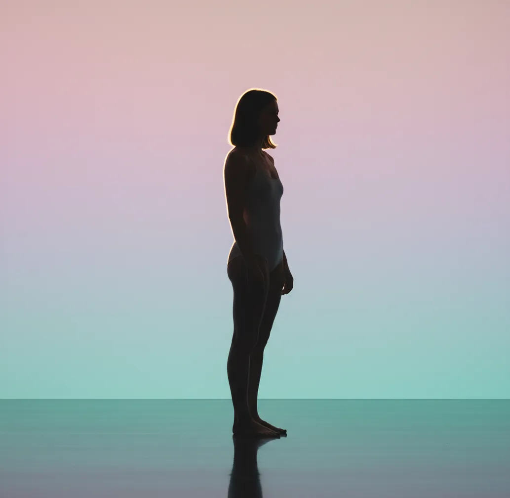
Creating your image...
To add a gradient background to photos, remove or isolate the original background with an AI cutout tool, choose a two-color or multi-color gradient layer, then refine the subject edge around hair, shoulders, and transparent areas. Use similar color tones, export at high resolution, and check for banding or halos before posting or printing.
What Does It Mean to Add a Gradient Background to Photos?
Adding a gradient background to a photo means replacing the original scene with a smooth color transition behind the subject. Most edits use a linear fade, radial glow, diagonal blend, or soft studio-style sweep. The subject is separated from the background with a mask, then placed on top of the new gradient layer.
This edit is useful when the original background is cluttered, dark, off-brand, or distracting. A gradient can make a portrait feel more polished, make a product photo look more consistent, or give social content a cleaner visual identity without requiring a physical studio backdrop.
How Do Gradient Photo Backgrounds Work?
Gradient photo backgrounds work by combining subject segmentation, alpha masking, and a generated or manually selected color fade. The editor first identifies the foreground subject at the pixel level, then creates a mask that controls which parts of the original image stay visible and which parts are replaced.
The most important technical detail is edge matting. Hair, fur, motion blur, glasses, and soft clothing edges often contain semi-transparent pixels, so a hard cutout can create a sticker effect. A good gradient edit preserves those transitional pixels while matching the new backdrop brightness to the original light direction.
How Do You Add a Gradient Background on a Phone?
Choose a clear source photo
Start with a high-resolution image where the subject is separated from the background by contrast, focus, or lighting. Window-lit portraits and product photos on plain surfaces are easier to mask cleanly.
Remove or isolate the background
Use an AI background remover or cutout tool to separate the subject from the original scene. Zoom in before accepting the mask, especially around hair, ears, shoulders, hands, product edges, and transparent packaging.
Select the gradient type
Use a linear gradient for banners and profile headers, a radial gradient for headshots, a diagonal fade for motion or fashion edits, and a soft vertical sweep for product photography.
Pick colors from the photo
Sample one color from the subject’s highlights, clothing, packaging, or brand palette, then choose a second color that is close in brightness. Subtle neighboring tones usually look more realistic than extreme color opposites.
Refine the edge and lighting
Check the cutout at 150% to 200% zoom. Reduce halos, soften harsh edges, and darken or brighten the gradient behind the subject so the background feels connected to the original lighting.
Export and inspect the final image
Export at the highest practical resolution, then view the image on a bright screen. Look for color banding, jagged edges, compression artifacts, or a visible outline before posting, printing, or adding text.
Which Gradient Style Should You Use for a Photo?
| Gradient style | Best use | Visual effect | Watch out for |
|---|---|---|---|
| Linear gradient | Profile banners, product cards, thumbnails | Clean color transition from one side to another | Can look flat if both colors have the same brightness |
| Radial gradient | Portraits, headshots, beauty edits | Creates a soft glow behind the face or product | Looks fake if the glow is too bright or perfectly centered |
| Diagonal gradient | Fashion, sports, music covers, event posts | Adds motion and energy without adding objects | Can distract from faces if contrast is too strong |
| Vertical studio sweep | Product photos, creator merch, catalog images | Mimics a seamless paper backdrop or light falloff | Needs smooth export settings to avoid banding |
| Mesh or multi-color gradient | Album art, posters, experimental social graphics | Feels more artistic and atmospheric | Can overpower realistic portraits and skin tones |
For natural-looking edits, start with a simple two-color gradient. More complex gradients work best when the final image is intended to feel graphic, stylized, or editorial.
What Are the Best Apps for Gradient Photo Backgrounds?
| Tool | Strength | Best for | Limitations |
|---|---|---|---|
| Pict AI | Fast AI subject cutouts with mobile background replacement | Quick portrait, product, and social edits on iOS or Android | Advanced layout control may be lighter than full design suites |
| Canva | Templates, brand kits, text layouts, and social formats | Creators who need gradient backgrounds plus typography | Precise edge cleanup can require extra manual adjustment |
| Adobe Express | Layered design tools, quick background removal, and Adobe ecosystem support | Marketing graphics, flyers, and multi-layer promotional images | Some assets, features, or exports may depend on account or plan |
| PhotoRoom | Product-focused background removal and commerce-style scenes | Shop images, marketplace listings, and clean product cards | Creative gradient control may vary by template and plan |
| Picsart | Stylized effects, stickers, filters, and social-first editing | Bold creator edits, fan art, and colorful profile content | Heavy effects can make realistic photos look overprocessed |
Choose the app based on the final use: fast cleanup, brand layout, product consistency, or stylized social design. Always check each app’s export resolution, watermark rules, and commercial-use terms before using an image for business.
What Gradient Colors Look Natural in Portraits and Product Photos?
Natural gradient colors usually come from the photo itself. For portraits, soft beige to peach, slate to charcoal, cream to pale blue, or muted mauve to dusty rose often work because they respect skin tones. For products, use one color from the packaging and one lighter neutral shade to create a studio sweep.
Reusable color recipe: "Create a subtle [linear/radial] gradient background using [color sampled from subject] fading into [soft neutral color]. Keep contrast low, preserve realistic lighting, and avoid neon saturation."
Creator workflow recipe: "For a profile photo, use a radial gradient that is slightly brighter behind the face and darker near the edges. For a product image, use a vertical gradient that is lighter at the top and slightly darker at the base to imitate studio lighting."
How Do You Make the Cutout Edge Look Real?
A gradient background looks real when the subject edge has the same softness, light direction, and color spill as the original photo. After removing the background, inspect the mask around hair, shoulders, fingers, jewelry, fur, and product corners. These areas reveal most AI cutout errors.
If you see a white or gray outline, reduce edge feathering or erase the leftover background fringe. If the subject looks too sharp, add a tiny amount of edge softness rather than blurring the whole image. For backlit subjects, a faint rim glow can be natural, but it should match the gradient color and not form a perfect outline.
Where Do Gradient Backgrounds Help the Most?
- Portraits and headshots: a soft gradient removes visual clutter while keeping the face central for LinkedIn, resumes, creator profiles, and portfolio pages.
- Product photos: a subtle vertical or radial fade can make small items feel photographed in a studio, especially when the original surface is uneven or off-brand.
- Social posts and stories: gradients create readable space for captions, stickers, countdowns, and calls to action without adding busy textures.
- Thumbnails and covers: a brighter gradient behind the subject improves separation on YouTube, podcasts, playlists, and short-form video covers.
- Gifts and prints: pastel or neutral gradients can turn casual portraits into cleaner images for framed prints, birthday graphics, invitations, or custom cards.
- Branding sets: using the same gradient palette across multiple photos helps a feed, shop, or portfolio feel visually consistent.
What Should You Watch Out for When Using Gradient Backgrounds?
- Hair, fur, smoke, lace, glass, and motion blur are difficult to mask because they contain semi-transparent pixels. Expect to refine these areas manually.
- Low-resolution exports can show gradient banding, especially in smooth blue, gray, or dark backgrounds. Export large and avoid excessive compression.
- Neon gradients can clash with real-world lighting. If the original photo was warm and soft, an electric blue or magenta fade may look pasted on.
- A subject photographed against a similar-colored background may produce inaccurate segmentation, especially around clothing edges and dark hair.
Frequently Asked Questions
The easiest method is to use an AI background remover, choose a gradient preset, then refine the subject edge before exporting. This avoids manually tracing the subject.
Yes. Use a mobile photo editor with background removal and gradient layers, then export the result as a high-resolution image for social posts, prints, or profile photos.
Yes. Android photo editors with AI cutout tools can isolate the subject and place a linear, radial, or custom gradient behind it.
A soft radial or vertical gradient works best for portraits because it adds depth behind the face without distracting from skin tones. Beige, peach, slate, cream, and muted blue are usually safe choices.
A vertical studio-style gradient is often best for products because it mimics a seamless backdrop. Use one brand or packaging color and one lighter neutral tone.
A white outline usually comes from leftover background pixels in the mask. Refine the edge, remove the fringe, and choose a gradient brightness that matches the subject edge.
Export at a high resolution, use gentle color transitions, and avoid heavy compression. Banding is most visible in dark, flat, or low-bit-depth gradients.
Yes. Gradients look more natural when one or both colors are sampled from the subject, clothing, packaging, shadows, or highlights already present in the image.
Usually no. Passports, visas, school IDs, and government documents often require a plain white or light background, so check the exact rules before editing.