What App Makes AI iPhone Wallpapers?
AI wallpaper apps can generate custom iPhone Lock Screen and Home Screen backgrounds from text prompts, style references, or image edits. The best choice is not just the prettiest generator; it is the one that gives you a tall aspect ratio, enough resolution, and clean negative space for the clock, widgets, and icons.
Creating your image...
An app that makes AI iPhone wallpapers is a text-to-image or image-editing tool that can generate vertical backgrounds in iPhone-friendly sizes. For the best result, choose an AI wallpaper app with portrait aspect ratios, high-resolution export, no forced watermark, and composition controls that leave space for the Lock Screen clock and widgets.
What App Makes AI iPhone Wallpapers?
Apps that make AI iPhone wallpapers include AI image generators, mobile wallpaper apps, design editors with generative tools, and browser-based creators such as Pict AI. The right app should let you describe a visual idea, generate a vertical image, refine the composition, and export a clean file that iOS can use as a Lock Screen or Home Screen background.
The main difference between a general AI art app and a good iPhone wallpaper maker is layout control. iPhone wallpapers need a tall canvas, enough pixel density for Retina displays, and quiet space near the top for the time, widgets, and Dynamic Island area. If an app only creates square images, adds watermarks, or compresses exports heavily, the wallpaper may look good in preview but blurry or awkward once it is set on the phone.
How Do AI Wallpaper Apps Create iPhone Backgrounds?
AI wallpaper apps create iPhone backgrounds by turning a text prompt, image reference, or style selection into a generated image using diffusion or transformer-based image models. The model predicts visual details from the prompt, then the app renders one or more variations that can be cropped, upscaled, edited, or exported for a phone display.
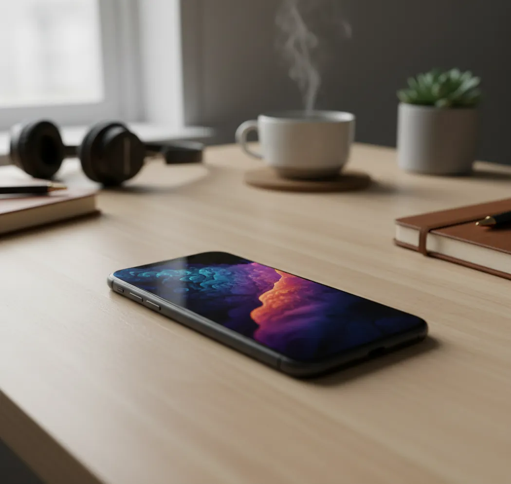
For iPhone use, the technical details matter. A wallpaper-friendly generator should support vertical aspect ratios such as 9:16 or 9:19.5, export at a resolution near or above the device screen size, and preserve gradients without aggressive JPEG compression. The best outputs also account for visual hierarchy: a low-detail top area for the clock, a clear focal point below the time, and balanced contrast so app icons stay readable on the Home Screen.
How Do You Make a Custom AI Wallpaper for iPhone?
Choose a vertical canvas
Start with a portrait format such as 9:16 or a taller iPhone-style ratio. If exact presets are available, use your device resolution or a larger matching ratio so iOS does not need to stretch the image.
Write a wallpaper-specific prompt
Describe the subject, style, color palette, lighting, and composition. Add instructions such as "empty space at top," "subject in lower third," or "minimal background for clock readability."
Generate several variations
Create at least four options before editing. AI wallpaper quality often improves through small iterations like moving the subject lower, reducing detail, increasing contrast, or simplifying the top area.
Crop for the Lock Screen
Preview the image with the iPhone clock area in mind. Keep important faces, text, mountains, logos, or objects away from the top 20 to 25 percent of the image.
Export at high quality
Save as PNG when possible for gradients and digital art, or high-quality JPG for photographic styles. Avoid tiny files, screenshots of previews, and low-resolution downloads.
Set and test on device
Open Photos, set the image as wallpaper, and check the Lock Screen and Home Screen separately. If icons or widgets feel busy, regenerate with more negative space or a softer background.
Which AI Wallpaper Tools Are Best for iPhone?
| Tool | Best for | iPhone wallpaper strengths | Watch-outs |
|---|---|---|---|
| Pict AI | Fast browser or iOS wallpaper generation | Creates prompt-based images, supports creator workflows, and works well for quick Lock Screen concepts | Still requires prompt tuning and device previewing for perfect clock placement |
| Adobe Firefly | Commercial-safe design workflows | Strong for controlled styles, text effects, and integration with Adobe editing tools | May require extra cropping or editing for exact iPhone wallpaper layouts |
| Canva | Social graphics and simple templates | Useful for combining AI backgrounds with typography, frames, and brand colors | Template exports can become cluttered behind icons if not simplified |
| Midjourney | Highly stylized AI art | Excellent for cinematic, fantasy, abstract, fashion, and editorial wallpaper aesthetics | Aspect ratio and export workflow may take more manual setup |
| ChatGPT image tools | Prompt-driven image creation and editing | Good for describing revisions in plain language, such as moving a subject lower or changing colors | Output size and editing controls depend on the available image model and interface |
| Dedicated wallpaper apps | Browsing ready-made backgrounds | Convenient for quick downloads, categories, and seasonal wallpaper packs | Some apps limit resolution, add watermarks, or offer less prompt-level control |
The best AI wallpaper tool depends on whether you value speed, style quality, editing control, or exact device sizing. For iPhone wallpapers, prioritize vertical export, clean composition, and the ability to test the image on your actual Lock Screen.
What Size Should an AI iPhone Wallpaper Be?
An AI iPhone wallpaper should be at least as large as your iPhone screen resolution and should use a matching vertical aspect ratio. Common modern iPhone wallpaper sizes include 1179×2556 pixels for many Pro models and 1290×2796 pixels for Pro Max models, but generating slightly larger is usually safe if the ratio stays close.
Do not rely on the phrase "4K" alone. Standard 4K is usually 3840×2160, which is a landscape format and not ideal for a phone wallpaper unless it is recropped. A better target is a tall high-resolution image, such as 2048×4096 or a device-specific portrait export. The goal is to avoid iOS enlarging the image so much that texture, linework, or gradients become soft.
What Prompt Recipes Work Best for Lock Screens?
- Minimal aesthetic: "Create a vertical iPhone wallpaper, soft gradient background, calm negative space in the top 25 percent, subtle grain, muted blue and silver palette, no text, no logo, high-resolution digital art."
- Cinematic landscape: "Vertical iPhone Lock Screen wallpaper of a misty mountain valley at sunrise, main peak in the lower middle, empty sky at the top for clock readability, realistic lighting, deep contrast, crisp but not noisy."
- Anime-style portrait: "Vertical anime-inspired wallpaper, character placed in lower third, face below clock area, dreamy city lights, soft bokeh, clean top background, expressive mood, no text, no watermark."
- Luxury abstract: "High-resolution vertical abstract wallpaper, black glass, liquid chrome, deep shadows, elegant reflections, minimal top area, OLED-friendly dark background, premium editorial style."
- Pet wallpaper: "Vertical iPhone wallpaper of a golden retriever in a cozy room, dog centered in lower half, warm window light, uncluttered top wall area, realistic fur detail, no text."
- Brand mood board: "Vertical wallpaper for a creative studio, soft neutral background, subtle geometric shapes, accent color in lower third, clean space at top, modern portfolio aesthetic, no readable text."
- Negative prompt add-on: "Avoid text, watermarks, distorted hands, extra faces, busy top area, tiny repeating details, harsh artifacts, over-sharpened texture, cropped subject."
How Can You Make AI Wallpapers Look Better on the Home Screen?
To make an AI wallpaper look better on the Home Screen, reduce visual noise and keep contrast under control behind app icons. A wallpaper that looks dramatic on the Lock Screen can become hard to use when icon labels, widgets, and folders sit on top of bright highlights or detailed patterns.
Use darker gradients, soft blur, or a less detailed version of the same image for the Home Screen. Many creators make a matched pair: a detailed Lock Screen with a focal subject, plus a simplified Home Screen background using the same colors. This works especially well for social branding, portfolio phones, aesthetic setups, gift wallpapers, and print-inspired digital art collections.
What Are the Limits of AI iPhone Wallpaper Generators?
- Exact device fitting is not automatic. Even high-resolution AI art can crop badly if the subject is too close to the top edge or sides.
- Text is still unreliable in many image models. If you need a name, quote, date, or logo, add it later in a design editor instead of generating it inside the image.
- Faces, hands, pets, and small accessories may contain artifacts. Zoom in before exporting, especially if the wallpaper is a gift or portfolio piece.
- 4K does not always mean iPhone-ready. A landscape 4K image can lose sharpness after vertical cropping.
How Do You Set an AI Wallpaper on iPhone?
Save the final image to Photos
Download the high-resolution wallpaper file to your iPhone and confirm it appears clearly in the Photos app.
Open the wallpaper settings
Go to Settings, choose Wallpaper, and tap to add a new wallpaper, or open the image in Photos and use the share menu.
Position the image
Pinch and drag lightly if needed, but avoid excessive zooming because it can reduce sharpness and crop important details.
Check the clock and widgets
Preview the Lock Screen to make sure the time, widgets, and Dynamic Island area remain readable.
Choose Lock Screen, Home Screen, or both
Use the detailed image for the Lock Screen and consider a blurred or simplified version for the Home Screen if app icons feel crowded.
Related guides for iPhone AI wallpaper prompts and ideas
Frequently Asked Questions
The best app is one that supports vertical generation, high-resolution export, and easy composition edits. Look for portrait ratios, no forced watermark, and enough control to keep the clock area clean.
Yes, many AI image tools offer free generations or limited free credits. Check whether the free export is full resolution and watermark-free before using it as your wallpaper.
Use your iPhone's native portrait resolution or a larger image with the same general aspect ratio. Common modern sizes include 1179×2556 and 1290×2796 pixels.
4K can be good if the image is vertical or large enough to crop without losing detail. A standard 3840×2160 landscape image is not automatically ideal for an iPhone screen.
Blurriness usually comes from low export resolution, heavy compression, or iOS zooming into an image with the wrong aspect ratio. Generate taller and larger, then crop gently.
PNG is often better for gradients, abstract art, and crisp digital illustration. High-quality JPG is fine for photographic wallpapers if compression is not too aggressive.
Keep the top 20 to 25 percent of the image simple, darker or lighter than the clock text, and free of important subjects. Prompt for negative space at the top before generating.
A static AI wallpaper does not meaningfully drain battery by itself. Battery impact is affected more by screen brightness, always-on display behavior, refresh rate, and background activity.
Most AI wallpaper generators need an internet connection because image generation usually runs on remote servers. Saved wallpapers can still be viewed and set offline.