How to Create a Poster With AI in 2026
To create a poster with AI in 2026, start with the final use case, write a prompt that describes the layout and visual style, generate several drafts, then refine typography, spacing, and export size. AI is fastest for concepts, backgrounds, and mood; human review is still essential for text, dates, logos, and print quality.
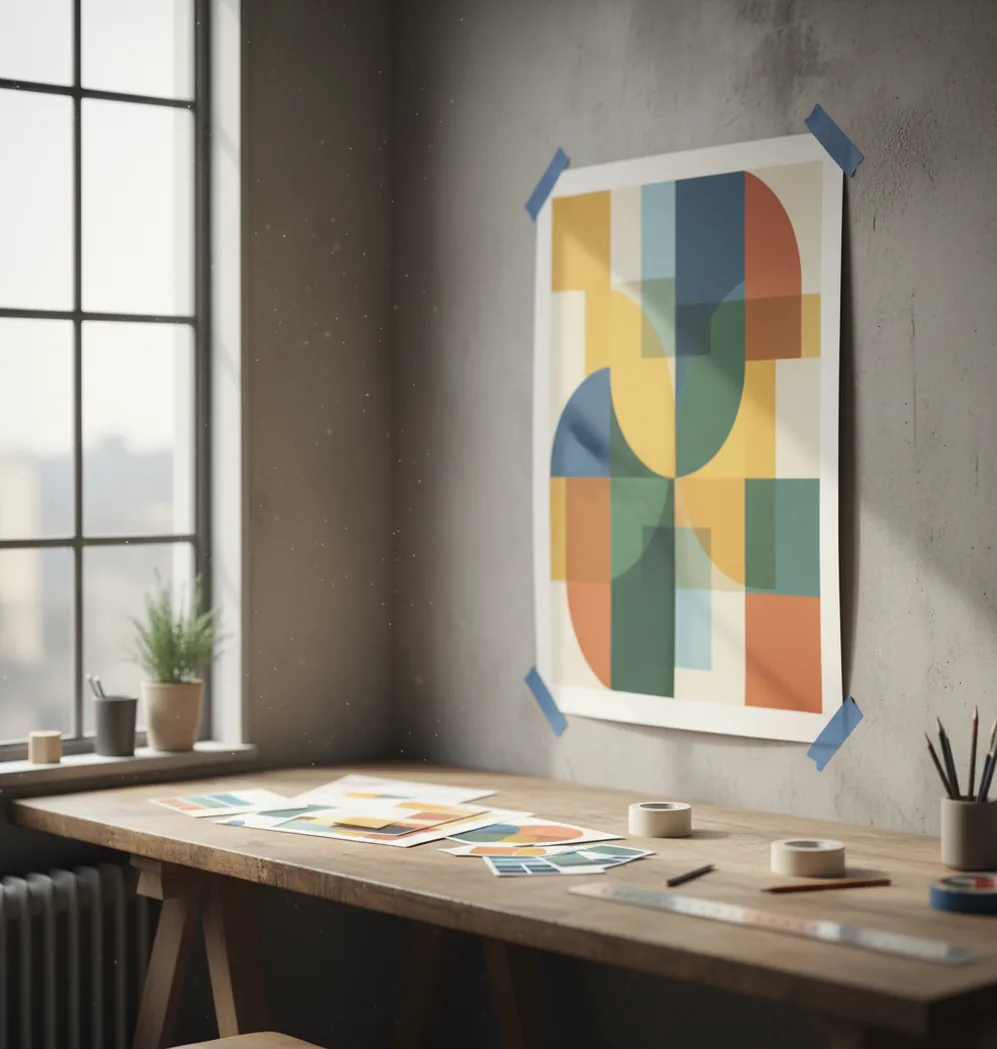
Creating your image...
To create a poster with AI in 2026, choose a target format, generate 2 to 4 poster concepts from a detailed prompt, select the clearest layout, then edit the text, margins, contrast, and export resolution. For print, use the highest available resolution, check readability at 100% zoom, and verify spelling, dates, logos, and image rights before sending it to a printer.
What does it mean to create a poster with AI?
Creating a poster with AI means using a generative image model or design assistant to produce a poster-style visual from a text prompt, reference image, or template. The AI usually handles the first visual draft: background, composition, color mood, subject placement, and graphic style.
It does not mean the poster is automatically finished. Posters still need design checks that AI often misses: readable typography, accurate event details, safe margins, consistent branding, and export settings for the final destination. Think of AI as the fast concept engine, then use editing tools to make the poster usable for Instagram, classroom walls, retail windows, gifts, art prints, or portfolio mockups.
How do AI poster generators turn a prompt into a layout?
Most AI poster generators use diffusion models, transformer-based image systems, or hybrid design models to convert text into visual structure. The model reads your prompt for subject, style, color, framing, and layout cues, then generates an image by predicting visual patterns that match those instructions.
Prompt details matter because poster design depends on hierarchy. Phrases like “empty top third for headline,” “large centered subject,” “high contrast text area,” “clean margins,” and “limited three-color palette” help the model reserve usable space instead of filling the whole canvas with detail. AI is usually better at mood, illustration, and composition than exact typography, so add final text manually when accuracy matters.
How do you create a poster with AI step by step?
Choose the final poster format first
Decide whether the poster is for a social post, phone story, A4 handout, 11 x 17 flyer, 18 x 24 print, or storefront display. The format affects aspect ratio, text size, margins, and export resolution.
Write a layout-aware prompt
Describe the subject, mood, colors, audience, and where text should go. Include practical instructions such as “blank space at bottom for date and venue” or “bold focal point visible from 6 feet away.”
Generate several draft options
Create 2 to 4 variations instead of trying to perfect the first output. Pick the version with the strongest hierarchy: clear focal point, readable empty space, balanced contrast, and no strange visual artifacts near the text area.
Add or replace text manually
Use an editor to add the headline, date, time, price, address, QR code, and call to action. Manual text is usually cleaner than AI-generated lettering, especially for print, brand names, menus, schedules, and sponsor lists.
Check readability and spacing
Zoom to 100%, step back from the screen, or view the design on your phone from arm’s length. Increase headline size, darken overlays, and keep important information away from the edges.
Export and test before publishing
Export at the highest available resolution. For print, request a proof or print a small test sheet before ordering a full run; for social, preview the poster inside the app where it will be posted.
Which AI poster tools are best in 2026?
| Tool | Best for | Strength | Watch out for |
|---|---|---|---|
| Pict AI | Fast mobile poster concepts | Quick prompt-to-image generation and easy phone-first iteration | Final print sizing and text accuracy still need review |
| Canva | Template-based posters and brand kits | Strong layout controls, stock assets, and team-friendly editing | Some assets, exports, and AI features depend on plan or licensing |
| Adobe Express | Polished social and promotional graphics | Good typography tools, Adobe ecosystem integration, and clean templates | Requires account workflow and licensing checks for premium assets |
| Microsoft Designer | Quick promotional graphics | Useful for fast concepts, captions, and simple layout generation | Less control than full professional design software |
| Midjourney | Highly stylized poster art | Excellent mood, illustration quality, and cinematic art direction | Needs another editor for precise text, dimensions, and print preparation |
The best tool depends on the job: use AI image generators for visual exploration, template editors for typography and layout control, and professional design software when exact print specifications are required.
What prompt should you use for an AI poster?
A good AI poster prompt includes the poster’s purpose, audience, subject, mood, color palette, composition, text-safe areas, and output style. The most reliable prompts describe visual hierarchy instead of only describing the theme.
Event poster template: “Create a bold poster background for a [type of event] featuring [main subject], [mood] atmosphere, [color palette], strong central focal point, empty top third for headline, clear lower area for date and venue, high contrast, clean margins, modern poster design.”
Sale poster template: “Design a promotional poster for [product or store type], bright retail lighting, large product hero image, simple background, space for discount text in the center, red and cream palette, readable from a storefront window, minimal clutter.”
Art print template: “Generate a gallery-style poster illustration of [subject], [art style], balanced negative space, limited color palette, subtle texture, no text, clean border, suitable for an 18 x 24 wall print.”
How do you make an AI poster print-ready?
Set the correct aspect ratio
Match the design to the final print shape before you export. Common poster formats include A4, 11 x 17, 18 x 24, and 24 x 36; cropping after the fact can cut off headlines or QR codes.
Use high-resolution export settings
Export the largest version available. For professional printing, 300 DPI is common for close-view posters, while large display posters may be acceptable at lower effective DPI because viewers stand farther away.
Keep text out of the trim zone
Leave safe margins around the edges and ask your printer for bleed requirements. A typical bleed is 0.125 inches, but specifications vary by vendor and paper size.
Check color and contrast
Screens use RGB light, while many print workflows use CMYK ink. Bright neon colors, deep blues, and saturated reds can shift in print, so request a proof when color accuracy matters.
Proof every factual element
Verify dates, prices, addresses, sponsor names, legal disclaimers, URLs, and QR codes. AI can create convincing fake text or symbols, so never treat generated details as reliable.
What poster sizes and export settings should you use?
Use the poster size that matches where people will see it. For social promotion, 1080 x 1350 works well for feed posts, 1080 x 1920 fits stories and reels covers, and square 1080 x 1080 is still useful for simple announcements. For print, common sizes include A4, 11 x 17, 18 x 24, and 24 x 36 inches.
For close-view print, aim for 300 DPI when possible; for large wall posters viewed from several feet away, lower effective resolution may still look acceptable. Export PNG for sharp graphics and screenshots, JPG for smaller file sizes, and PDF when your design tool supports proper print output with embedded text, bleed, and crop settings.
When should you use AI instead of a poster template?
Use AI when you need original visual direction quickly: a moody concert background, a surreal art print, a themed party flyer, or multiple campaign concepts for a brand moodboard. AI is especially helpful when you do not already have photography, illustration, or a finished visual style.
Use a template when the poster depends on clean information design: schedules, menus, sponsor grids, school notices, corporate announcements, or anything with lots of text. A strong workflow is to generate the visual background with AI, then place accurate typography and layout elements in a design editor. That hybrid approach gives you speed without sacrificing readability.
Where do AI posters still break down?
- AI-generated text is often unreliable. It may produce misspelled words, fake sponsor names, incorrect dates, or decorative letters that look readable at a glance but fail on close inspection.
- Small details can soften during export. Thin lines, tiny icons, QR codes, and fine textures may look acceptable on a phone but become blurry or noisy on an 18 x 24 print.
- Exact brand control is limited. AI can approximate a color palette, but it may not match specific HEX, RGB, Pantone, or CMYK values without manual correction.
- Faces, hands, logos, and product shapes can distort. This matters for band posters, real estate flyers, retail ads, and portfolio pieces where credibility depends on accuracy.
Frequently Asked Questions
Choose a target size, write a prompt with subject, style, colors, and text-safe space, generate a few versions, then edit the text and export at the highest resolution available.
The best tool depends on your workflow: image generators are best for original visuals, template apps are best for typography, and professional design software is best for print control.
Yes, AI can create a poster concept for print, but you should verify resolution, margins, bleed, spelling, color, and file format before sending it to a printer.
Include the poster purpose, subject, audience, mood, color palette, composition, and empty areas for text. Layout phrases like “clear top headline area” and “high contrast” usually improve results.
AI can generate decorative text, but it is often inaccurate. For real posters, add important words manually in an editor so names, dates, prices, and addresses are correct.
For social, use sizes like 1080 x 1350 or 1080 x 1920. For print, choose the final physical size first, such as A4, 11 x 17, 18 x 24, or 24 x 36 inches.
Generate 2 to 4 versions for a quick project and more for branding or paid work. Choose the draft with the clearest focal point, strongest contrast, and most usable space for text.
You do not need advanced design skills, but you do need basic checks for hierarchy, contrast, spacing, and readability. AI helps with visual exploration, not final proofing.
Commercial use depends on the tool’s terms, the assets used, and whether the design includes protected logos, characters, people, or artist styles. Always review licensing before selling or advertising with the poster.